With thousands of different typefaces on offer, it’s vital to have a select few that act as pillars in your collection. The following 13 typefaces (shown in alphabetical order) are ones you’ll find many graphic designers have used.
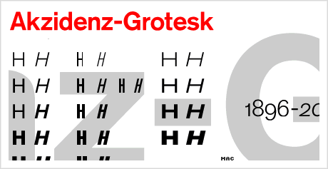
Akzidenz Grotesk, the first ever sans-serif typeface to be widely used, was originally released in 1898, by the H. Berthold AG type foundry. At first glance, it can sometimes be mistaken for the Helvetica or Univers typefaces.
More on Wikipedia
Head over to Typophile if you want to learn more about the roots of Akzidenz Grotesk.
Akzidenz is available to buy from Linotype, under the name Basic Commercial. The font family was renamed based on Linotype’s digitization of the typeface, which can also be bought under the Akzidenz name from other type resources.
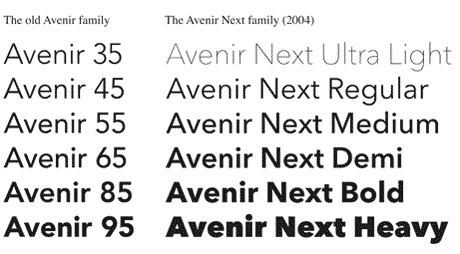
#2 Avenir
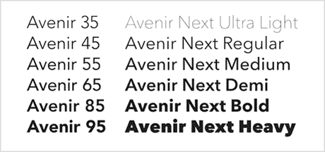
The Avenir typeface was designed by Adrian Frutiger in 1988. Linotype interviewed Adrian Frutiger and asked him about the reasons for the new design of Avenir, its special characteristics and potential uses. Here’s an excerpt from the interview:
Looking back on more than 40 years of concern with sans serif typefaces, I felt an obligation to design a linear style of sans serif, in the tradition of Erbar™, Futura®, and to a lesser extent Gill Sans®. These have purely constructed characters from which the element of a handwriting movement has been removed. Obviously this could not be an outstanding new creation, but I have tried to make use of the experience and stylistic developments of the 20th century in order to work out an independent alphabet meeting modern typographical needs.
The city of Amsterdam uses Avenir extensively in its graphic identity. BBC2 has also begun to use Avenir as its main corporate font for its channel logo and identity, another shift away from the once universal use of the Gill Sans font across all of the BBC’s output.
You can purchase the Avenir family from Linotype.
#3 Bodoni
Bodoni is the name given to a series of serif typefaces first designed by Giambattista Bodoni in 1798.
This typeface has a narrower underlying structure with flat, unbracketed serifs. The face has extreme contrast between thick and thin strokes, and an overall geometric construction.
More on Wikipedia
Dave Farey at Fonthaus has written an interesting article, discussing the confusion in the market over the many different types of Bodoni that are available.
…there are numerous siblings, third and fourth cousins, plus poor relations of doubtful parentage, cloaked under the protection of the Bodoni name, creating confusion and ultimately disenchantment.
You can see the different font family weights and also buy Bodoni from Linotype here.
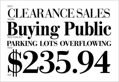
#4 Caslon
Caslon is a family of serif typefaces designed by William Caslon (1692–1766). His earliest design dates to 1734.
The Caslon types were distributed throughout the British Empire, including British North America. Much of the decayed appearance of early American printing is thought to be due to oxidation caused by long exposure to seawater during transport from England to the Americas. Caslon’s types were immediately successful and used in many historic documents, including the U.S. Declaration of Independence.
After William Caslon’s death, the use of his types diminished, but saw a revival between 1840–80 as a part of the British Arts and Crafts movement. The Caslon design is still widely used today, and for many years, a common rule of thumb for printers and typesetters was to “set it in Caslon” if no other font was specified.
More on Wikipedia
There’s an article on Typophile about Caslon, where this is mentioned:
Caslon’s type was popular in every sense. It was popular in the eighteenth century (until it was eased out by modern faces in the early 19th). When the fashion of “old face” revived in the 19th, many in England and America looked to Caslon’s type as the model. And, at a time when lay people probably knew less about font-names than they do now, “Caslon” was a name quite a few people did know. George Bernard Shaw, for example, absolutely insisted that his work be set in Caslon.
At the time of writing, there are 71 Caslon families available for purchase.
#5 Clarendon
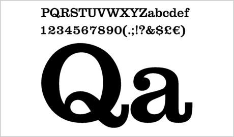
Clarendon was created in England by Robert Besley, for the Fann Street Foundry, in 1845.
One of my logo design portfolio pieces makes use of the Clarendon typeface, and you can see it here: Davidson Locksmith logo design.
Different weights are available to buy from Linotype.
#6 Franklin Gothic
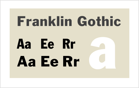
Franklin Gothic was designed by Morris Fuller Benton, in 1902. “Gothic” is an increasingly archaic term (used widely in the past but quite rare today), meaning ’sans-serif’, which is found primarily in Canada, the United Kingdom, and the United States.
Victor Caruso drew the multi-weight family for the International Typeface Corporation (ITC) in 1980. Caruso’s redrawing of Franklin Gothic for ITC consists of a slightly enlarged x-height and a moderately condensed lowercase alphabet.
More on Wikipedia
The ITC Franklin Gothic is available to purchase from Linotype.
#7 Frutiger
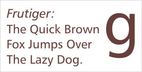
Frutiger was designed by the Swiss type designer Adrian Frutiger. It was commissioned in 1968 by the newly-built Charles De Gaulle International Airport at Roissy, in France, which needed a new directional sign system. Instead of using one of his previously designed typefaces, such as Univers, Adrian Frutiger chose to design a new one. The new typeface, originally called Roissy, was completed in 1975 and installed at the airport in the same year.
Frutiger’s goal was to create a sans-serif typeface with the rationality and cleanliness of Univers, but with the organic and proportional aspects of Gill Sans. The result is that Frutiger is a distinctive and legible typeface. The letter properties were suited to the needs of Charles De Gaulle – modern appearance and legibility at various angles, sizes, and distances. Ascenders and descenders are very prominent, and apertures are wide to easily distinguish letters from each other.
More on Wikipedia
The Frutiger font family can be viewed and purchased on Linotype.
#8 Futura
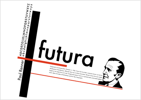
Futura was designed in 1927 by Paul Renner. Although Renner was not associated with the Bauhaus movement, he shared many of its structural elements, and believed that a modern typeface should express modern models, rather than be a revival of a previous design.
Futura’s success spawned a range of new geometric sans-serif typefaces from competing foundries, and remains one of the most used sans-serif types into the 21st century. It is used prominently in the graphic identity of Volkswagen and Union Pacific. The former Swiss airline, Swissair, also used Futura from the 1950s to the 1990s.
Boeing commercial Airplanes almost exclusively use a variation of Futura (medium, Lt Bt, Demi) in their flight-deck labeling, for both information decals and instrumentation. Futura remains an important typeface family and is used on a daily basis for print and digital purposes as both a headline and body font.
More on Wikipedia, Futura poster designed by Adelle Jurgens
Visit Linotype to view different Futura weights, and purchase the font family.
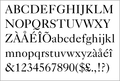
#9 Garamond
Garamond came to prominence in the 1540s, first for a Greek typeface that Claude Garamond was commissioned to create for the French king François I. The commission was to be used in a series of books by Robert Estienne. The French court later adopted Garamond’s Roman types for their printing, and the typeface influenced type across France and Western Europe.
More on Wikipedia
View and purchase the ITC Garamond font family on Linotype.
#10 Gill Sans
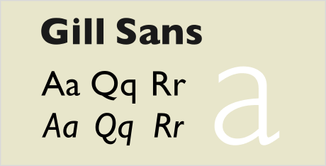
Gill Sans was designed by Eric Gill in 1927-30. Gill was a well established sculptor, graphic artist and type designer, and the Gill Sans typeface takes inspiration from Edward Johnston’s ‘Johnston’ typeface, used for the London Underground, which Gill had worked on whilst apprenticed to Johnston.
Eric Gill attempted to make the ultimate legible sans-serif text face, and Gill Sans was designed to function equally well as both a text face and for display.
More on Wikipedia
Purchase the Gill Sans font family.
#11 Gotham
Gotham was designed very recently (2000) by New York type designer, Tobias Frere-Jones. Gotham’s letterforms are inspired by a form of architectural signage that achieved popularity in the mid-twentieth century, and are especially popular throughout New York City. (Designer Tobias Frere-Jones credits the sign on the Eighth Avenue facade of New York City’s Port Authority Bus Terminal, an especially clear example of this style, as an artifact which inspired the Gotham project.)
More on Wikipedia
Gotham is the typeface of choice for the Freedom Tower cornerstone at the World Trade Center site, and can be bought through Hoefler & Frere-Jones.
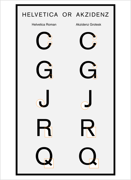
#12 Helvetica
Helvetica was created by Miedinger with Eduard Hoffmann at the Haas’sche Schriftgiesserei (Haas type foundry) of Münchenstein, Switzerland. Haas set out to design a new sans-serif typeface that could compete with Akzidenz Grotesk in the Swiss market. Originally called Neue Haas Grotesk, the typeface’s name was changed by Haas’ German parent company, Stempel, in 1960, to Helvetica – derived from Confederatio Helvetica, the Latin name for Switzerland – in order to make it more marketable internationally.
More on Wikipedia
Here’s an image showing the subtle differences between Helvetica and Akzidenz.
The Helvetica font family is available for purchase through Linotype.
#13 Univers
Univers is the name of the typeface designed by Adrian Frutiger in 1956. Both Univers and Helvetica, which are sometimes confused, take inspiration from the 1896 typeface Akzidenz Grotesk (listed above). These typefaces figure prominently in the Swiss style of graphic design.
The Univers type family consists of 14 weights, plus 14 corresponding oblique weights, and 16 variants with central European and Cyrillic character set.
In 1997 Frutiger reworked the whole Univers family in cooperation with Linotype, thus creating the Linotype Univers, which consists of 63 weights.
More on Wikipedia
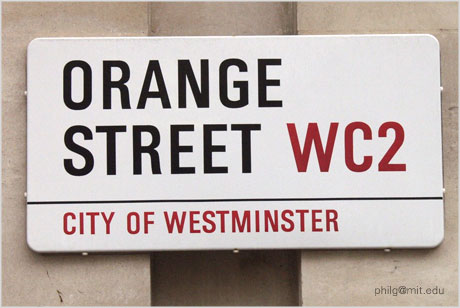
I was unsure about the exact typeface used for the London street sign (shown above), and had to ask others what they thought. If you think it’s something other than Univers Bold Condensed, please do let me know.
Check out the Univers font family on Linotype’s website.